My top 10 Webflow mistakes
Ten things I wish someone told me when I started with Webflow.
👋 Hi, Ondrej here. Every week, I write about growing my Webflow freelance business, sharing freelance tips, Webflow skills, and learnings from the community.
If this is your first time reading Flowletter and you’re not subscribed, here’s what you missed in the past weeks:
Here are ten things I wish someone told me when I started with Webflow.
None of these mistakes will break your website, but avoiding them will make your life as a developer easier. Many are also good practices if you consider joining the Webflow Expert program and its requirements list.
1. Not using a style guide
Working without a style guide often leads to inconsistencies in your design. You might end up with mismatched fonts, colors, and inconsistent spacing. A well-defined style guide ensures consistency across your project and makes updates and maintenance easier. Here are a few of my favorite style guides you can start with:
Nikolai Bain’s Simple Style Guide
Finsweet’s Client-First system
Timothy Ricks’ Lumos
2. Using Webflow columns
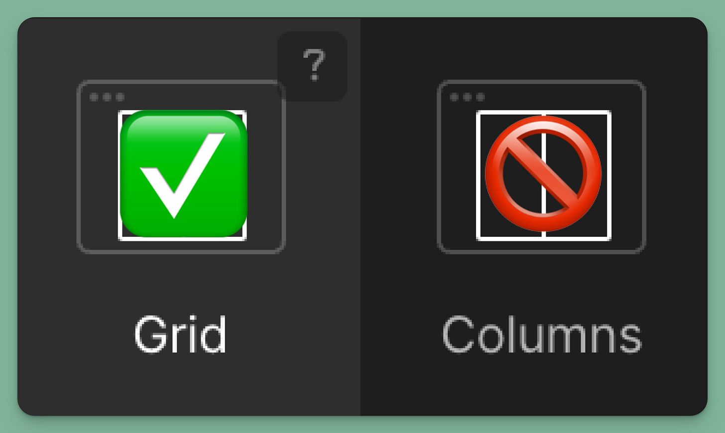
In my first project, I used Columns to achieve a side-by-side layout. However, Columns as an element are not very responsive, so I use Flexbox or Grid for my layouts.
3. Not giving images height and width
When you don't specify image dimensions, content can shift as the page loads, especially on slower connections. This creates a poor user experience and lowers your Lighthouse score. Always set your image dimensions to prevent this issue and improve your site's performance.
4. Not optimizing images for web
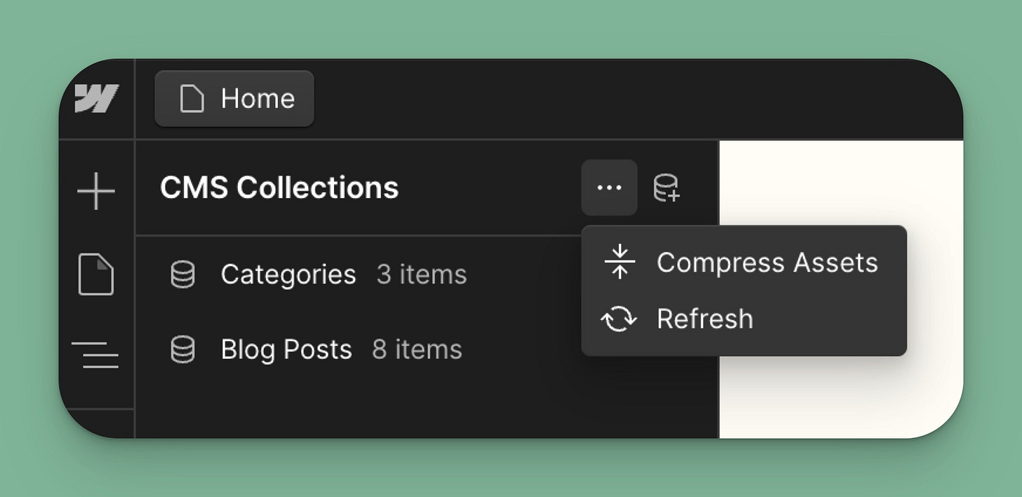
Large, unoptimized images significantly slow down your site. Webflow has built-in tools to compress images in the Assets library and Collections (something I learned just recently).
But I like to use Squoosh because I can tweak how much the image will be compressed and resize images that don’t need to be that big. It exports AVIF and Webp and is easy to use.
5. Creating custom classes for everything
While it might seem like a good idea for granular control, creating custom classes for every element makes your project challenging to manage and update, use Webflow's class system effectively, leveraging combo classes for minor variations. This approach makes your project more maintainable in the long run.
6. Overusing combo-classes
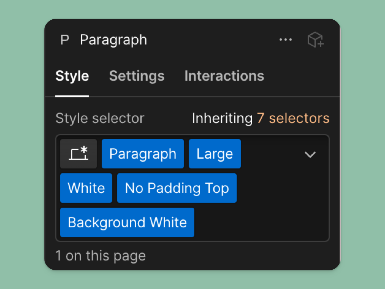
Another class-related issue is overusing combo classes to customize a global class. Webflow doesn’t recommend going below three levels of combo classes. If you find yourself this deep, it’s likely time to create a dedicated class for your element.
While combo classes are helpful, overusing them can lead to overly complex styling that's hard to maintain. Use combo classes for minor adjustments, not significant changes. It might be time to reassess your base styles if you rely heavily on combo classes.
6. Not using Flexbox to position elements
Flexbox is a powerful tool for creating flexible, responsive layouts. If you're still relying solely on absolute positioning or floats, you're missing out on Flexbox's benefits. It simplifies creating layouts that adapt well to different screen sizes.
7. Not having a proper page structure
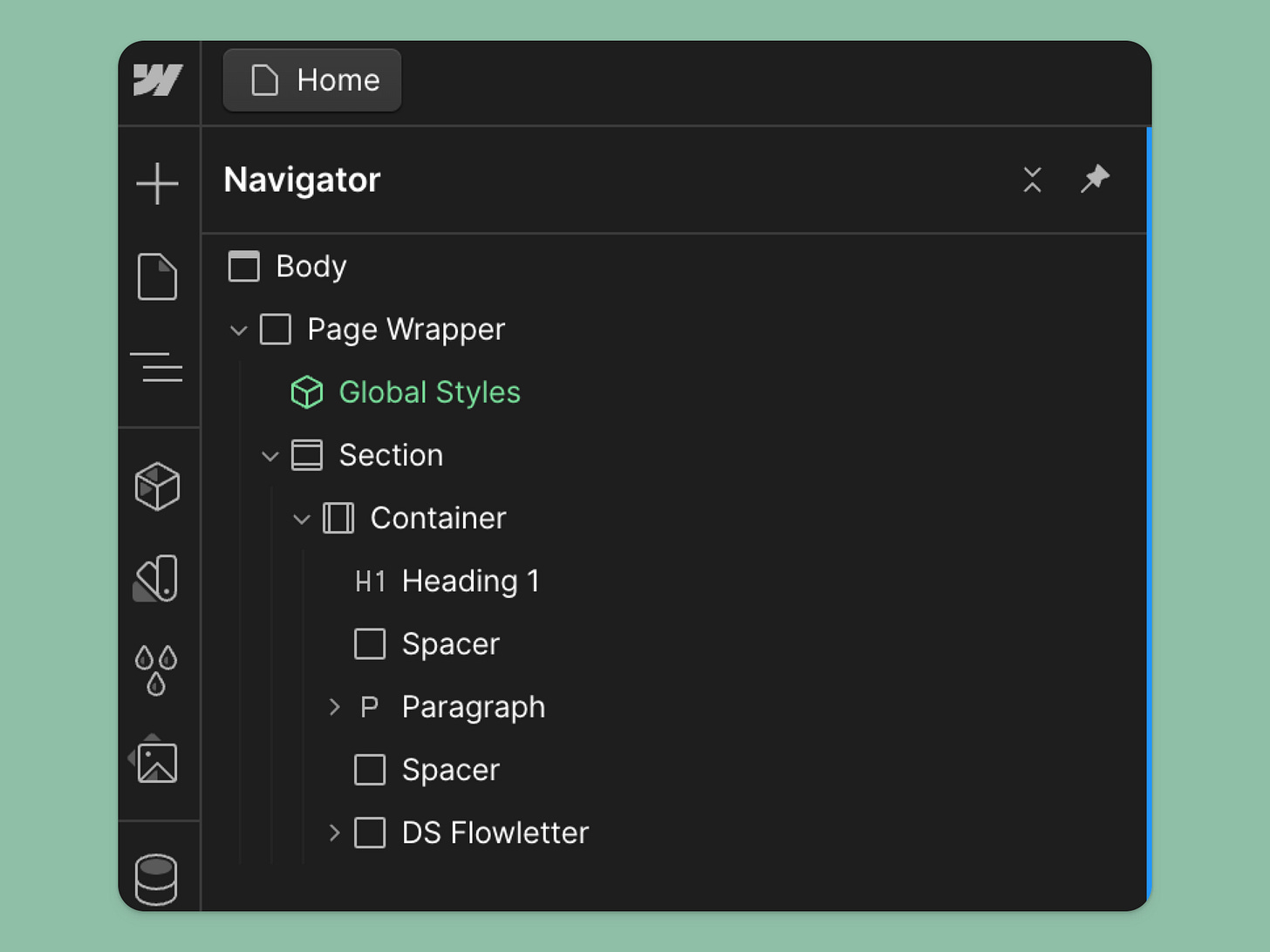
A good page structure (Section > Container > content div) isn't just about organization. It makes your project easier to style consistently and simplifies the process of making global changes when needed. A logical structure improves your workflow and makes your project more manageable.
I use the following structure:
Sections: used to set top and bottom padding
Container: used to set left and right padding
Actual content
This allows me to have consistent padding and customize it when needed. For instance, I can have a full-screen section with no top and bottom padding and a full-width container with no padding.
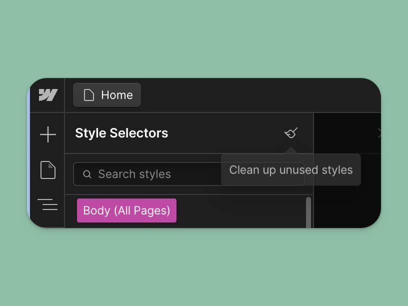
8. Not cleaning up unused styles and interactions
Unused styles and interactions bloat your project, potentially slowing load times and making maintenance more difficult. Regularly removing unused elements keeps your project lean and efficient, and it's a good practice that improves overall site performance.
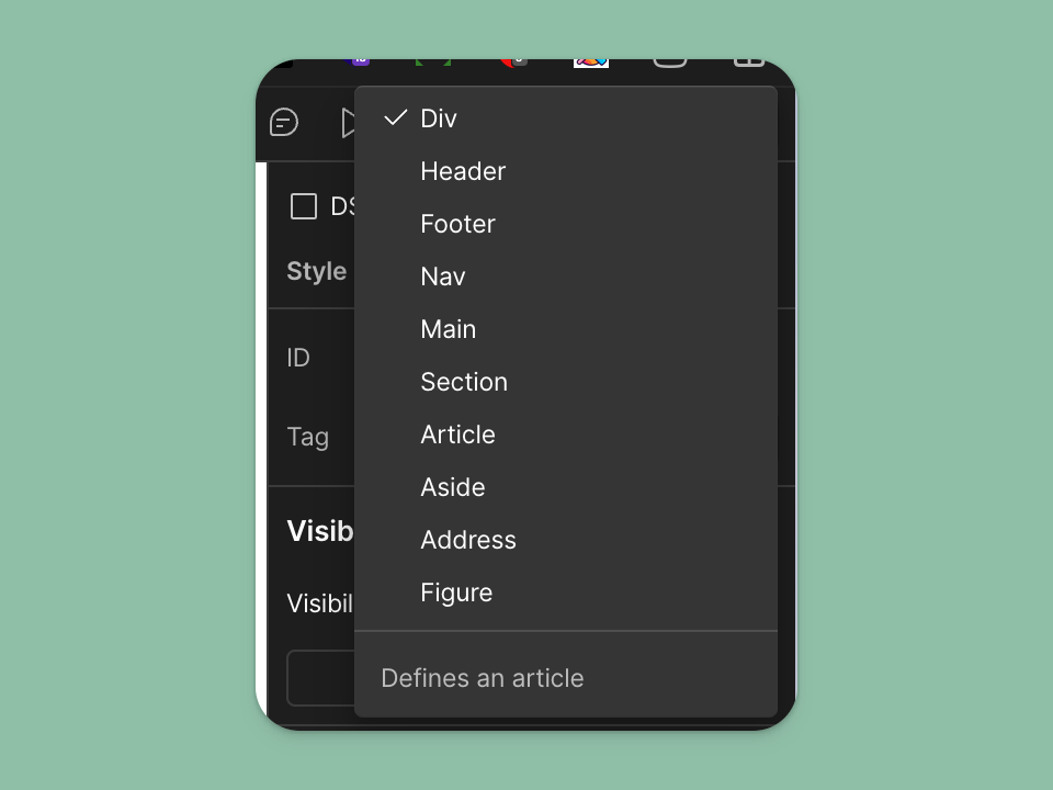
10. Not assigning tags (Header, Footer, Section, etc) to their content
This is one that I discovered much later in my Webflow journey. Proper semantic structure improves your site's accessibility and helps search engines better understand your content.
Using the correct tags for different parts of your site (like headers, footers, and sections) creates a clear, logical structure for your content. This benefits both users and search engines.
You can set them by selecting a section, container, or div and heading to Settings > Tag.
Your turn!
What about you? What are some mistakes you’ve made in the past?
Are you a Webflow freelancer? Subscribe if you haven’t already. I send new posts about growing a Webflow freelance business, tips and tricks for building in Webflow, and useful tools every week.


