I built my own Webflow design system
What I learned building a variables-based design system in Webflow
👋 Hi, Ondrej here. Every week, I write about growing my Webflow freelance business, sharing freelance tips, Webflow skills, and learnings from the community.
If this is your first time reading Flowletter and you’re not subscribed, here’s what you missed in the past weeks:
Now is a great time to build Webflow apps: an interview with Tom Elliot from fluidSEO
The failures that got us to where we are: my personal Webflow journey
I recently concluded that while immensely flexible and powerful, the Client-First system is overkill for simple projects—at least for me.
I’ve been using Client-First for over a year now in all my projects - big and small. One big reason for this is Relume’s component library, which is written using the Client-First design system.
I’ve started to suspect that this Relume+Client-First setup is slowing me down.
Now, you might think this is crazy—after all, Relume gives you hundreds of components you can copy-paste straight into your design. And it syncs with your Client-First style guide. So where’s the slow-down?
Most designs we build for clients are simple variations of common web layouts. These standard layouts are easy to create in Webflow from scratch, and it’s usually easier than adapting one of Relume’s pre-built components, especially once you start messing around with custom section paddings or element spacing.
Then, there is the problem of class naming. I know Finsweet’s strategy of dedicated section and component names makes sense once you have a ton of these components, but in small projects, it’s just too much renaming, and I’ve often ended up with very long class names.
So, I decided that for simple projects, I’d use my own design system.
Setting some ground rules
Before starting, I put down four rules I wanted my system to follow:
less is more – fewer preset classes, fewer padding options, less of everything
rely on Webflow’s variables where it makes sense,
naming should be as simple as possible and not rely too much on multi-level combo classes,
out-of-the-box responsive fonts and components.
These helped me to stay within the confines of a simple design system and not go overboard.
I should also acknowledge that I’ve taken inspiration from Lumos and Timothy’s excellent video on working with variables in Webflow. Lumos is definitely the way to go if you ever need a very robust variables-based framework.
Secondly, I must mention Nikolai Bain’s simple style guide and his post on building a design system.
Less is more
Many popular design systems are robust. They are designed for flexibility, accounting for all possible scenarios. As a result, they grow in complexity. Instead of having 3 spacer types, they have 8. Instead of having 2 text sizes, they have 9; you get the idea.
Since I’ll be using this system for simple projects (brand websites with 4-10 pages, a blog, and a contact form), I don’t have to optimize for all eventualities, and I can keep it simple.
Using Webflow’s variables
I was stoked when Webflow introduced its new variables and variable manager. While imperfect (e.g., it still lacks reorder options), it seems ideal for storing my entire design system. It’s far easier to update because it's accessible right from the left menu, and if set up correctly, I can make sweeping changes with a few variable updates.
Simple naming convention and page structure
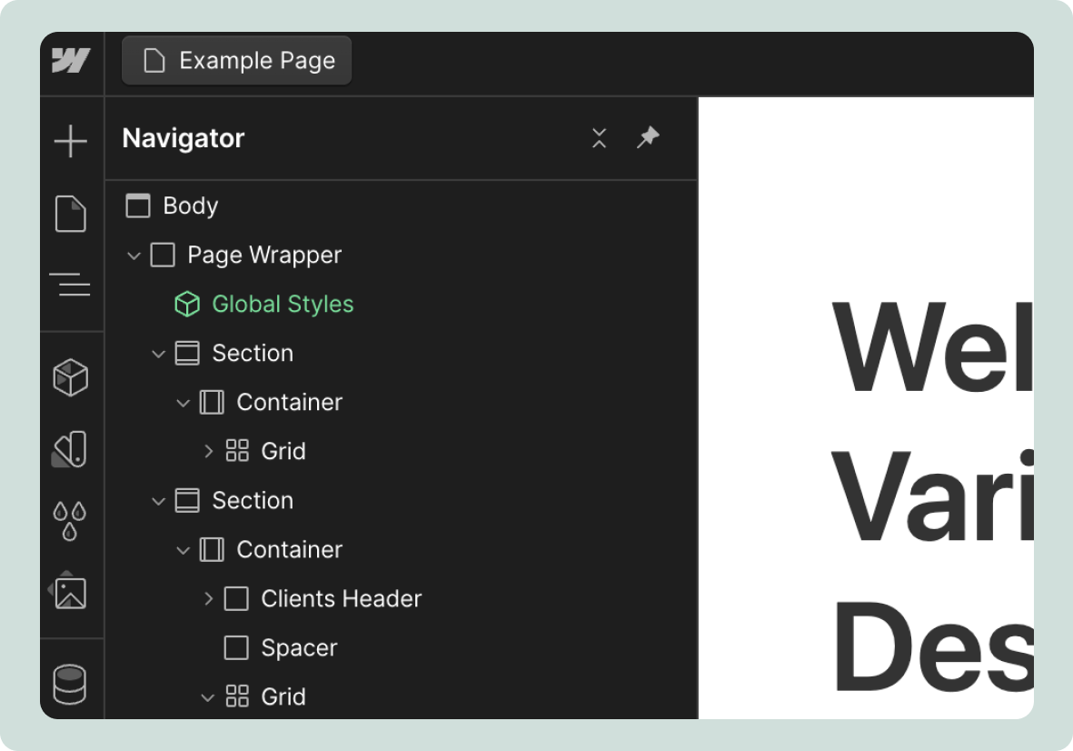
Another benefit of designing a system to be used in simple projects is that I can use a more straightforward naming convention. Here’s an example page structure:
All my content is wrapped in a Page Wrapper so I can copy and paste an entire page (since you can’t copy the Body tag).
Inside, I’ve got a Section → Container → Content structure. As you can see, I’m using Webflow’s native Section and Container components. I find their icons make it easier to navigate the page structure.
Custom content inside the container is named according to its purpose using plain English. In the above example, I have a DIV wrapping a header above client logos, so I named it Clients Header.
Responsive
I wanted my design system to be as responsive as possible out of the box. There are three areas I focused on:
Desktop/tablet/mobile font sizes
Responsive paddings and spacing
Responsive icons
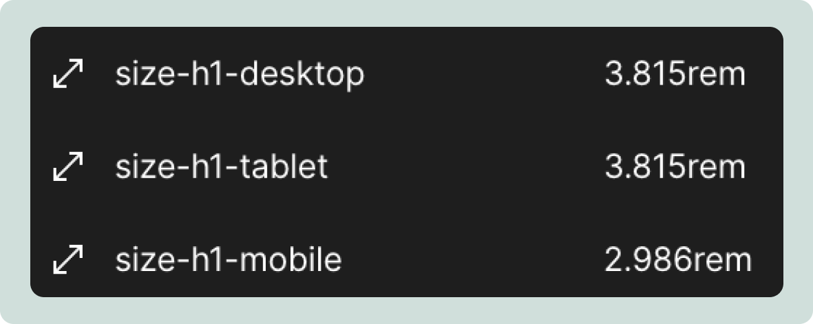
Unfortunately, Webflow’s Variables don’t (yet) support breakpoint sizes. This means I had to create separate sizes for every breakpoint.
Still, I like that I can change all my font sizes just by opening Variables and don’t have to switch breakpoints.
Using the Variable-Based design system
I’ll walk you through the basics and how I work with it. The Webflow preview is here, in case you want to follow along. If you find this helpful, you can also clone it.
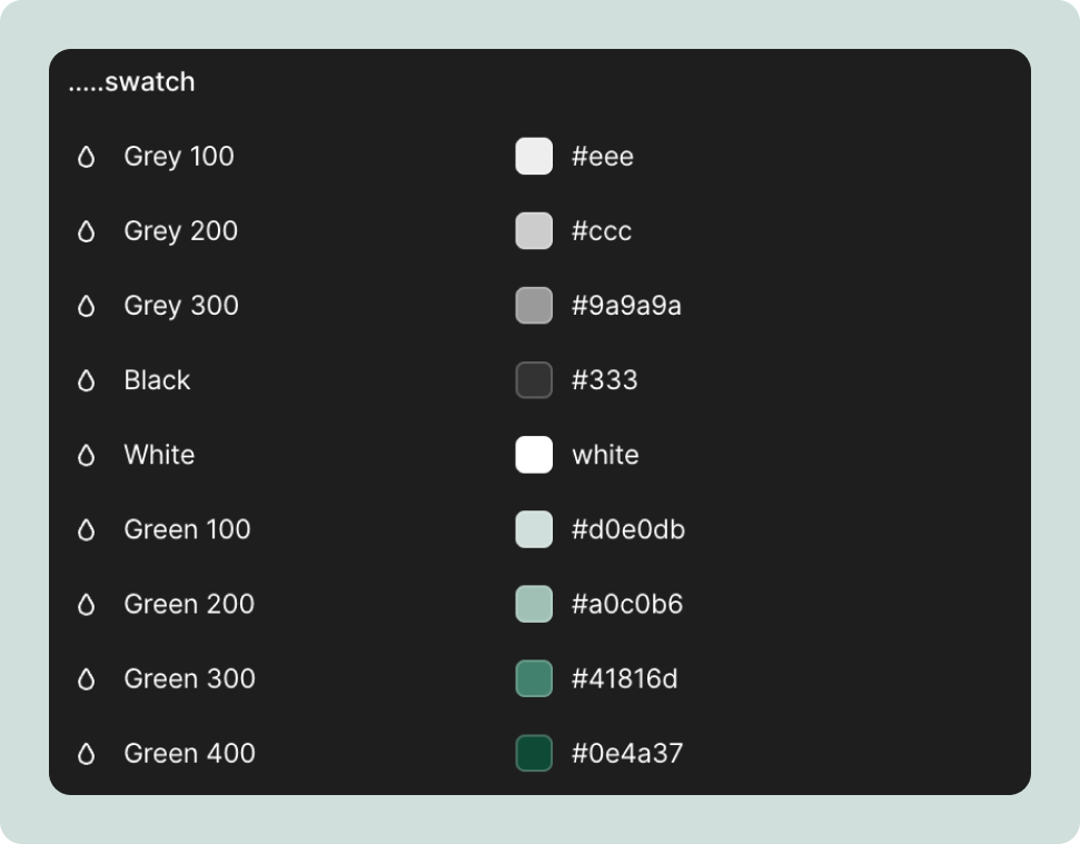
Color swatch
All colors are stored in the swatch folder in variables. I’ve got some primary colors pre-defined (Greys, Black and White).
Globals
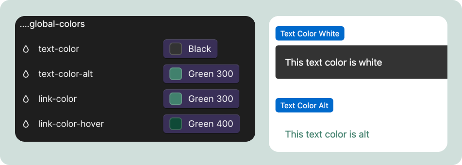
I have a few globals that let me adjust the overall style quickly. The first are global colors for my text and links.
The second is global sizes for the border-radius used in buttons, images and forms and grid spacing, which I use in most of my layouts.
Fonts
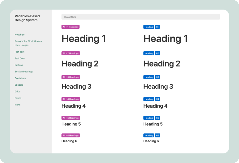
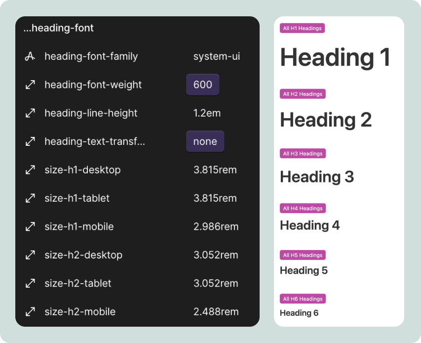
Fonts are a good example of the power of variables. Let’s look at headings first. With just one click, I can change the font family, font weight, line height, and text transforms for all my headings, as well as font sizes for desktop, tablet, and mobile. In this example, I’m using the Major Third and Minor Third typography scale.
Besides styling the Heading HTML tags (pink classes in Webflow), I also have dedicated classes (e.g., [Heading] [H1]). This is useful when you want a heading to be H1 in your HTML structure but have a style of H3 in your CSS. The cool thing about variables is that changes apply to both HTML Tags and CSS classes. I found this really speeds up my setup and also brings greater consistency.
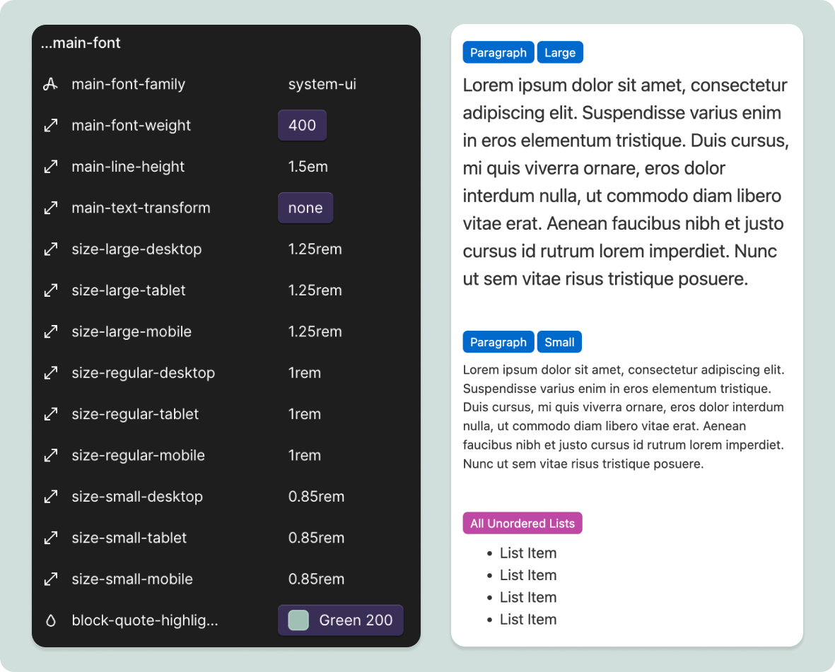
A similar story are the main font settings.
Buttons
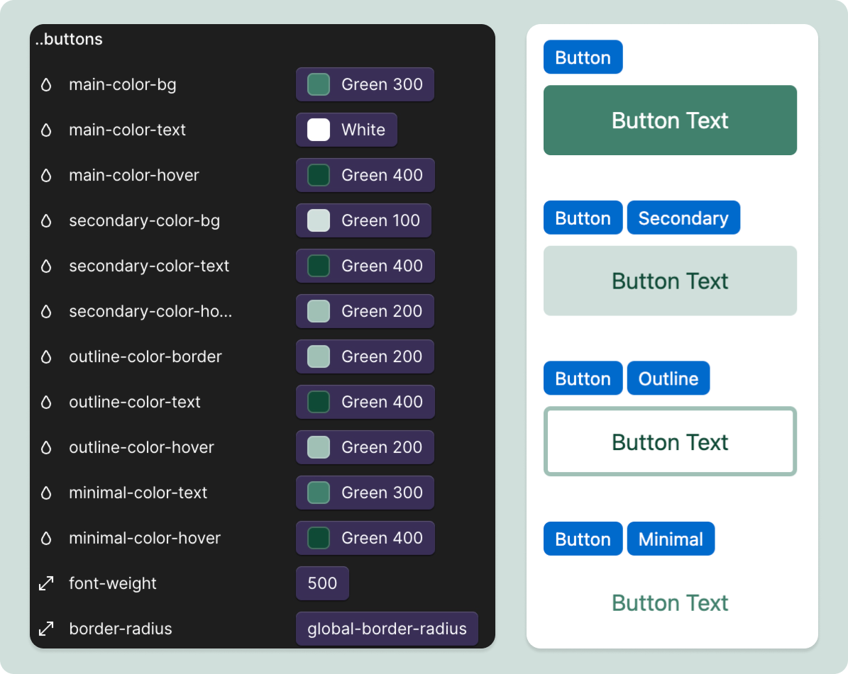
Button colors and font-weight are also set in variables. I was debating this, as you don’t see the button live when making color changes. What convinced me are hover styles, as it’s much easier to set them here in one place instead of in the style selector.
Forms
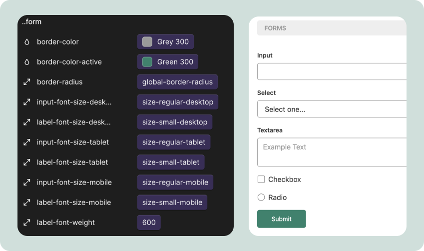
Forms let you set the border color, radius, and font style.
Icons
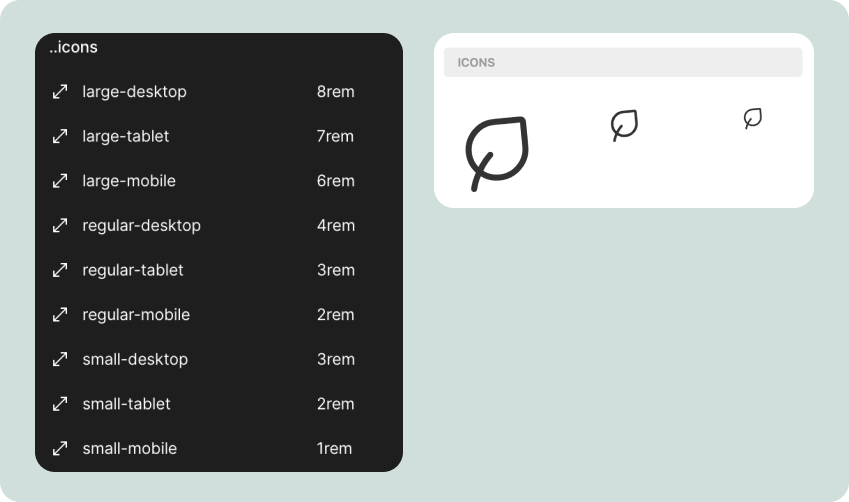
I also wanted a consistent and responsive way to manage my icons. In the spirit of less is more, I created only three icon sizes—small, medium, and large—and a size for every breakpoint.
Section Paddings
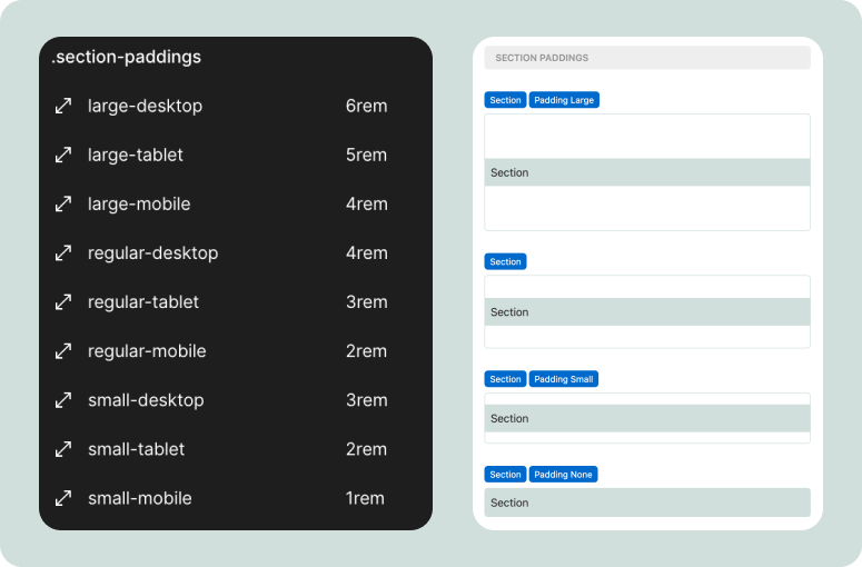
My sections have four vertical padding styles: large, regular, small, and none (this is the padding that separates one section from another). Again, they are defined for each breakpoint.
Containers
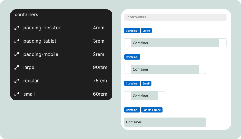
The containers come in three sizes: small, regular, and large. I also applied responsive horizontal padding to them and have a padding none option.
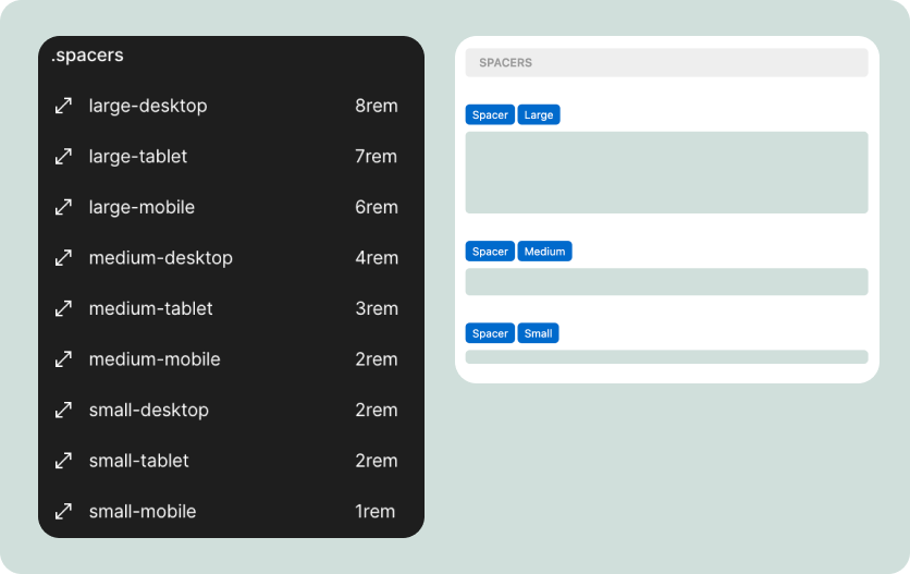
Spacers
The last set of elements I use are spacers. I’ve discovered that this spacing strategy is the most flexible for me. I’ve made my spacers responsive, so they are different sizes for each breakpoint. This helps me create visually balanced layouts.
What I learned building a design system
Building a design system was a great learning experience. I understand the compromises you need to make between flexibility and complexity. The more flexible you want your system to be, the more complex it becomes. So, it makes sense to start by defining what you’ll use your system for.
I’ve also learned a lot about Webflow variables and the extent to which you can stretch them. For instance, using font-weights and text-transforms in variations requires a bit of custom code since this variable type is not supported. Similarly, variables do not support breakpoints, so you have to create a dedicated variable for each breakpoint.
What’s next
I’ll be using this design system in my projects and iterating on it as time goes on. I want to stick to the principles I outlined initially and don’t want it to get bloated.
If you’re interested, you can preview and clone this design system. I’d love to hear your thoughts on how I can improve it.
Are you a Webflow freelancer? Subscribe if you haven’t already. I send new posts about growing a Webflow freelance business, tips and tricks for building in Webflow, and valuable tools every week.



Congrats on the launch mate! You finally did it!
Thanks for putting this together! Are you considering updating it to take advantage of Variable Modes now that they are available?