12 Webflow typography tips
Typography scales, responsive fonts, ideal line length/height, and more.
Getting the typography right can take your design from average to awesome.
Here are 11 tips I use in my Webflow design and development to make sure my typography is always on point.
1. Use a typography scale to calculate your font sizes
There are a few popular typography scales (Minor Third, Major Third, Golden Ratio, etc.) that help you calculate your font sizes from paragraph to H1. I like to use them because it takes the guesswork out of picking the correct font size.
My favorite calculator is Typescale. It gives me a preview of the fonts on a dummy landing page and blog post on both desktop and mobile.
Here’s how I use it to pick my typography scale.
2. Try Fluid Responsive
Fluid responsive fonts scale with the size of the browser window. This allows you to create designs that look consistent across all window sizes. You’ll need to use a bit of custom code to do this, but the end result is well worth it.
If you’re using Finsweet’s client first, you can enable Fluid Responsive using the Finsweet browser extension.
If you want a generic solution, I recommend using También’s Fluid Setup, which generates responsive fonts for you.
Here’s a tutorial to set this up:
3. Set your default font on the body tag
Font settings are inherited from parent elements. This means you can set the default font size on the body tag, which will update all your fonts on your website (unless a specific font has been assigned to a class).
To do this, click on your Body element in the Navigator, go to the Style selector, and select Body (All Pages). Now, set your page's default font and font size.
4. Use CH units to make your paragraphs more readable
According to Smashing Magazine, the ideal line length for paragraph text is between 45 - 85 characters, with the optimum being 60 characters per line.
The cool thing is that you can set this in your CSS settings right in Webflow using CH (character) units.
5. Use text wrapping to better align your text
You can use a custom CSS property called text-wrap with the value balance to align your text in a more balanced way. Look at this example:
If you have a long string of characters (like a long URL), your text might start to overflow on mobile or in smaller containers. To fix this use Wrap: Anywhere
6. Set your line height to 150% of the font size
Again, referring to Smashing Magazine, the ideal line heigh for paragraphs is 150%. You can experiment with this based on your design. However it’s not recommended to go under 130%.
7. Use REMs for your typography
To improve accessibility of your website use REMs (Relative EMs). This unit is relative to the font size set in your user’s browser settings. The default is 16px. If the user has a reading impediment and sets a larger font size, your website fonts will automatically scale for them.
8. Don’t center-align long paragraphs
Center-aligned text makes it hard to read because there isn’t a clean line on the left for the eye to follow. Always left-align longer paragraphs (like 4 or more lines).
9. Check your color contrast
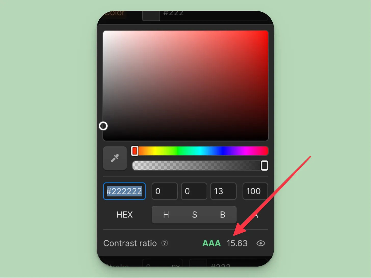
Poor color contrast makes your text hard to read and makes it impossible to read for people with visual disabilities. Webflow has a built-in contrast checker you can always reference when placing text over a colored background or using lighter text color.
If you’re designing in Figma, you can use the A11y plugin or check your color manually using an online contrast checker.
10. Take it easy with text-decoration
Two things to keep in mind here:
Underlines should be reserved for links.
All caps make text harder to read and screen readers read individual letters instead of words.
So make sure your underlines don’t confuse visitors and use all-caps sparingly.
11. Experiment with font pairings
Font pairings can add creativity to your design. If they work it’s like pairing the right wine with the right cheese. However, you can easily go wrong here, especially if you pick odd fonts.
A good place to start exploring font pairings is Fontpair, a collection of popular Google Font pairings.
You can also use Fontjoy to generate font pairings based on the contrast you want to achieve.
12. Self-host all your fonts
I previously ran a speed comparison between using Google Fonts directly in the Webflow font selector and self-hosting them. I was able to lower the First Contentful Paint from 4.1s to 3.8s and the Largest Contentful Paint from 5.7s to 5.1s.
This can improve your SEO.
To self host your fonts, upload them in the Font settings of your project. For Google Fonts, you can use the Google Webfonts Helper to download the font files.
If you want to learn more about other SEO improvements check out my guide on boosting Webflow SEO.
Thanks for reading and see you next week!
—Ondrej


