How to Structure Your Webflow Website for Scalability
Learn how to set up your Webflow website the right way to save time and make future updates easier.
👋 Hi, Ondrej here. Every week, I write about growing my Webflow freelance business, sharing freelance tips, Webflow skills, and learnings from the community.
If this is your first time reading Flowletter and you’re not subscribed, here’s what you missed in the past weeks:
When I first started using Webflow, one of the most useful things I learned was the importance of proper website structure.
A proper structure will save you a lot of headaches, fixing responsiveness and consistency issues across your sites.
I'll walk you through the essential components of a well-structured Webflow site, from basic setup to advanced implementation.
Common mistakes
Many new Webflow developers (me included) begin their page construction by placing layout elements—such as grids, flexboxes, or columns—directly inside the body tag. While this might seem logical at first, it creates significant problems down the line. This approach makes mobile responsiveness much harder to manage and leads to inconsistencies when building multiple pages.
Think of your website structure like building a house. You wouldn't start by placing furniture directly on the foundation - you need walls and rooms first. The same principle applies to web development. Without proper containment and sectioning, your layout elements lack the structural support they need to maintain consistency across different screen sizes and page types.
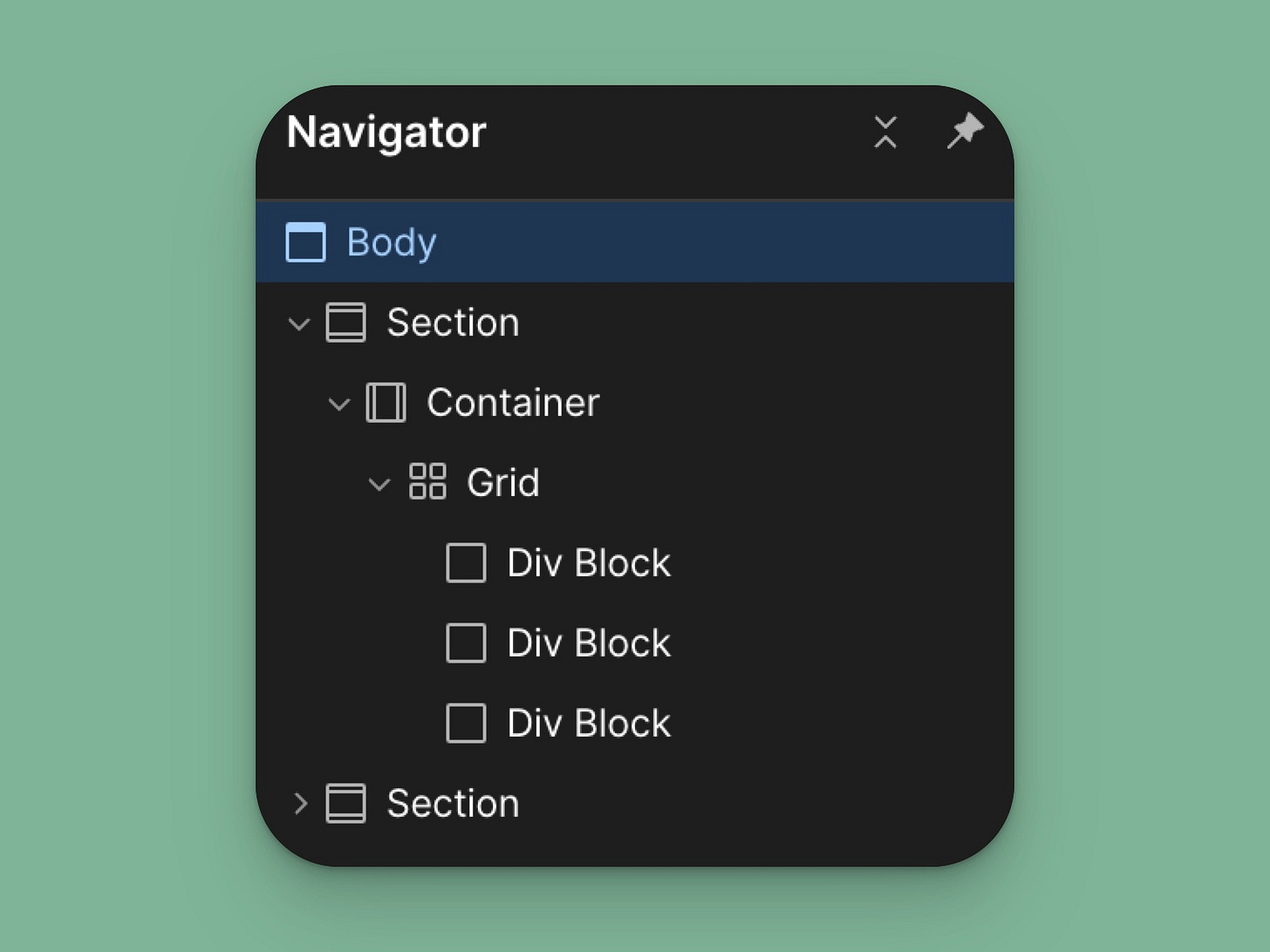
Let me show you my approach to structuring your Webflow website. The hierarchy consists of five key layers, each serving a specific purpose:
BODY - The body tag serves as your foundation
SECTION - Sections divide your content into meaningful blocks
CONTAINER - Containers control content width and centering
LAYOUT - Layout elements (like grids) organize your content
CONTENT - Actual content (text, images, buttons) fills these layouts
This structured approach might seem like extra work initially, but it's an investment that pays off tremendously as your website grows.
Sections
When implementing sections, I set them to full width by default. This gives me complete control over important visual elements:
Background colors or images that extend edge-to-edge
Consistent height management across different types of content
Clear visual separation between different content areas
Proper spacing between major page elements
One crucial aspect of sections that often gets overlooked is proper naming. I use combo classes for sections. I start by creating a default Section class, which has top and bottom padding. From there, I can create a combo class to change the background, remove the padding, etc. I also make sure to assign the correct HTML tag to my section, which helps with SEO (you do this in the Settings of your section element in the right-hand pane).
Here’s my default section setup:
Top and bottom padding: 4rem on desktop, 3rem on tablet, 2rem on mobile
You’ll notice I use REM units instead of pixels. UX Planet has a good explanation of why REMs are better than PXs.
Containers
Now, let's talk about containers - the elements that go inside these sections. Rather than using Webflow's default container width of 940px, I prefer creating a custom container class set to 75rem maximum width. This wider container works better for modern screens while maintaining good readability. The container ensures that your content stays centered and readable, even on large displays.
I always add left and right padding to my containers to prevent content from touching the screen edges - an issue that becomes particularly noticeable on mobile devices.
Here's my standard container setup:
Maximum width: 75rem
Center alignment
Auto margins on left and right
Left and right padding: 4rem on desktop, 3rem on tablet and 1.5rem on mobile
Width set to 100% to ensure proper scaling
Layouts
When creating layouts in Webflow, I rely on a universal grid system that maintains consistency across the entire website while providing flexibility for various layouts. I've found that having a set of predefined grid layouts saves significant development time and ensures visual harmony throughout the site.
Here are the core grid layouts I implement in every project:
The 1:1 grid is my most commonly used layout, featuring two equal columns. I set it up with:
Two columns at 1fr each
2rem gap between columns
Equal height columns for content alignment
Vertical stack on mobile (below 767px)
For asymmetrical layouts, I use either 2:1 or 1:2 grids. The 2:1 grid allocates:
First column at 2fr
Second column at 1fr
Same 2rem gap
The 1:2 grid reverses this ratio:
First column at 1fr
Second column at 2fr
For content-rich sections, I implement 3-column and 4-column grids:
Three equal columns (1fr each) for feature lists or brief content blocks
Four equal columns for card layouts, team members, or logo showcases
Both convert to 2 columns on tablet (below 991px)
Single column on mobile (below 767px)
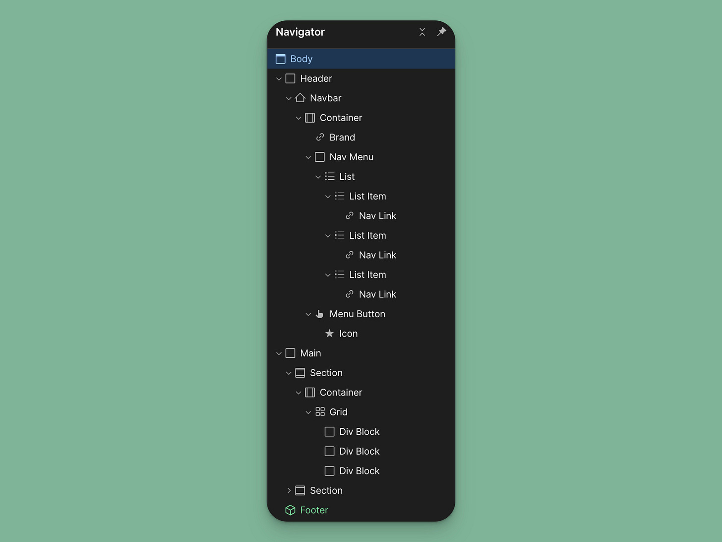
Adding HTML tags – header, navigation, footer, and <main> tag
To optimize my page for accessibility and SEO, I add layout-oriented HTML tags to my structure. Most of my pages have standard components, like a navigation, a footer, etc. To properly organize this content, it’s useful to understand HTML tags (quick video intro from Kevin Powell).
In Webflow, you set the HTML tag in the right panel under Settings.
Here’s how I organize my layout:
BODY
HEADER - holds the logo and navigation that’s repeated on every page.
NAVIGATION - I place the navigation in a List element for better accessibility.
MAIN - holds my main content (there should be only one per page). Here, I can also nest an ARTICLE tag if I’m working with a blog post.
SECTION - holds individual sections of the page
CONTAINER
FOOTER - holds the footer information
Bonus: Create a static template Starter Page
Here’s a tip that will save you time building new pages. Using Webflow’s Static Template Page, you can create a blank page that includes this structure and use it when you create new pages.
Next steps
The approach I've outlined - from nested sections to page wrapper components - will give you a solid foundation for any web project.
To take your Webflow development even further, I've created a Variables Based Design System that combines this structural framework with a powerful variables-based approach. This system allows you to make global design adjustments with just a few clicks using Webflow Variables.
Are you a Webflow freelancer? Subscribe if you haven’t already. I send new posts about growing a Webflow freelance business, tips and tricks for building in Webflow, and useful tools every week.


Thanks for the valuable information!