
Color palettes for web designers - Part 1
3 ways to create the perfect color palette for your next web design project

👋 Hi, Ondrej here. Every week, I write about growing my Webflow freelance business, sharing freelance tips, Webflow skills, and learnings from the community.
If this is your first time reading Flowletter and you’re not subscribed, here’s what you missed in the past weeks:
Now is a great time to build Webflow apps: an interview with Tom Elliot from fluidSEO
The failures that got us to where we are: my personal Webflow journey
I’ve been exploring new ways of making my designs stand out. After covering typography, I spent some time exploring colors. Like with most things, there’s a science behind the art.
In this two-part series, I’ll explore 6 ways you can approach colors when designing a website. We’ll start with monochromatic, analogous, and triadic color palettes in part one and follow up with complementary, tetradic, and split-complementary in part two.
1. Monochromatic color palette: the power of a single hue
Let's start with the simplest of the color schemes - monochromatic. While simple, a well-executed monochromatic palette can give your designs a very sophisticated look.
What is it?
A monochromatic color scheme uses variations in lightness and saturation of a single hue. Think different shades, tones, and tints of one color.
Monochromatic color schemes are all around us. A stormy sky or the forest floor—all examples of a single hue and it’s lighter and darker tones. Famous artists have made entire careers using monochromatic colors.

How to create it
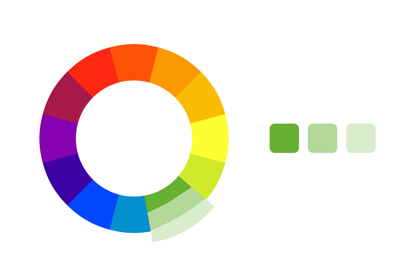
Choose your base hue (let's say green)
Create lighter tints by adding white
Create darker shades by adding black
Create tones by adding gray
You can use a monochromatic color palette generator. My favorite is ColorKit, because it includes a color contrast checker.
Pros:
Creates a cohesive, harmonious look
Easy to create and manage
Great for establishing a strong brand identity
Works well for minimalist designs
Cons:
Can lack contrast if not done carefully
Might feel boring or bland if overused
Examples

Wayside is the transdisciplinary design and research practice of Curry J. Hackett. His website was a Webflow awards finalist.

Ollivere, a Webflow developer, built his portfolio with a super simple monochromatic color scheme that relies on beautiful illustrations.
Pro tips
The key to a successful monochromatic scheme is contrast. Make sure you have enough variation between your lightest and darkest shades to create visual interest and hierarchy in your design. It’s a good idea to create variations of the chosen hue from very light to very dark.
If you're worried about your monochromatic design feeling flat, try adding texture or subtle patterns to create depth. In Webflow, you can easily achieve this with background images or SVG patterns.
2. Analogous Color Palette: Harmony Through Neighbors
If monochromatic feels too limiting, but you still want a harmonious look, analogous color schemes might be the way to go.
What is it?
An analogous color scheme uses colors that are adjacent to each other on the color wheel. Typically, it involves a dominant color, a supporting color, and a third color that's a mix of the two. Think sunset vibes: red, orange, and yellow.

How to create it
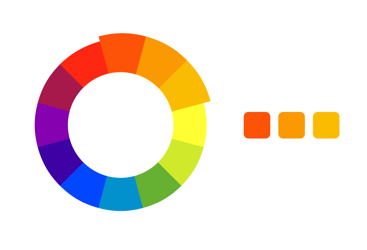
Choose your primary color
Select the colors directly next to it on the color wheel
Decide on your dominant color and use the others as accents
I like Canva’s color wheel for generating analogous colors.
Pros:
Creates a serene, harmonious look
Feels natural and pleasing to the eye
Offers more variety than monochromatic schemes
Great for creating depth and dimension
Cons:
Can lack contrast if not balanced properly
Might feel too "safe" for brands wanting to make a bold statement
Examples

Uji Matcha uses an analogous color scheme in their product imagery and I think it looks awesome.

An example of a blue analogous color scheme on Visium’s website.
Pro tips
The key to a successful analogous scheme is balance. A good rule of thumb is to use the 60-30-10 rule: 60% dominant color, 30% secondary color, and 10% accent color.
If you're worried that your analogous scheme lacks contrast, try varying the saturation and lightness of your colors. Pairing a highly saturated dominant color with more muted supporting colors can create striking designs.
3. Triadic Color Palette: Balanced and Vibrant
The last color scheme we’ll cover today is called Triadic and it’s the most vibrant so far.
What is it?
A triadic color scheme uses three colors evenly spaced around the color wheel. Think red, yellow, and blue—the classic primary colors. But don't worry—you're not limited to just those.

How to create it
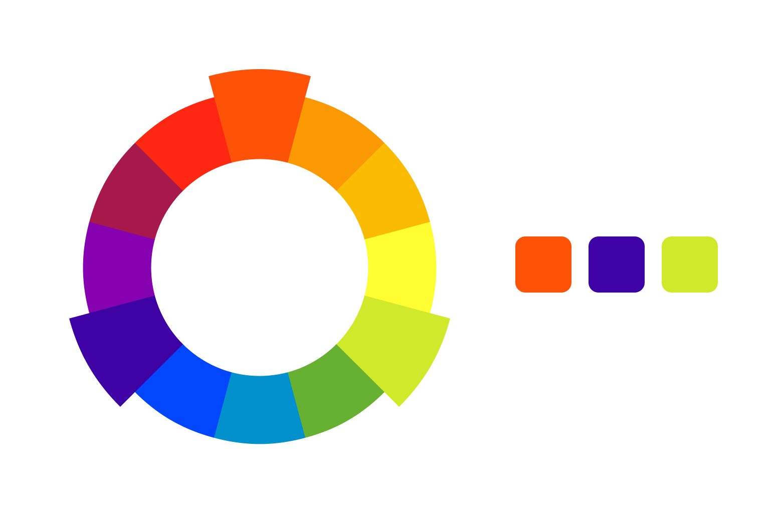
Pick any color on the color wheel
Find the two colors that form an equilateral triangle with your first choice
Decide which color will be dominant and which will be accents
Here, I like using ColorKit’s palette generator; it comes up with creative triad combinations.
Pros
Creates a vibrant, energetic look
Offers good contrast while maintaining balance
Provides a wider range of color options
Great for designs that need to pop
Cons
Can be overwhelming if not used carefully
Might be too bold for more conservative brands
Example

Alex Chen uses a bold red, green, and blue triadic color scheme in their portfolio design.
Pro tips
Create a set of tints and shades for each of your three main colors. This gives you more flexibility in your design while maintaining the triadic relationship.
The key to a successful triadic scheme is balance. It's usually best to let one color dominate and use the other two as accents. This prevents your design from looking like a rainbow explosion (unless that's what you're going for, of course!).
If you find your triadic scheme too intense, try muting two of the colors and using the third as a bold accent. This can create a more sophisticated look while still leveraging the energy of the triadic relationship.
Are you a Webflow freelancer? Subscribe, if you haven’t already. I send new posts about growing a Webflow freelance business, tips, and tricks for building in Webflow, and useful tools every week.
–Ondrej