
An Update to the Variables Based Design System
Bringing variable modes and collections to VBDS v2.

Webflow released Variable Modes a few weeks ago, allowing you to define multiple values for each variable. You can have automatic modes (for breakpoints) and manual modes.
I’ve wondered what Webflow planned to do with all that real estate in variables – now I know. I’m a big fan of organized stuff, so this update made me very happy.
As soon as I had some spare time, I updated VBDS (Variables Based Design System) to support variable modes.
Working with modes and collections
The best way to make modes work is to group your variables into collections. Timothy Ricks’s video on modes is an excellent introduction, and I recommend watching it before you start.
When I created the first version of my design system, collections didn’t exist yet. But today, they help me achieve two things:
Keep my variables organized. Before, all my variables were in one collection, which ended up being a very long list that was hard to navigate. Now, I’ve got thematic collections that make it easy to find and change values. It’s also easier for anyone else to understand the basic structure of my design system.
Grouping based on mode types. Collections allow you to group variables based on the modes you plan to apply to them. It’s best to group automatic and manual mode variables separately. This is to avoid creating unused variable values and bloating your code.
Here’s the grouping I ended up with for my design system.
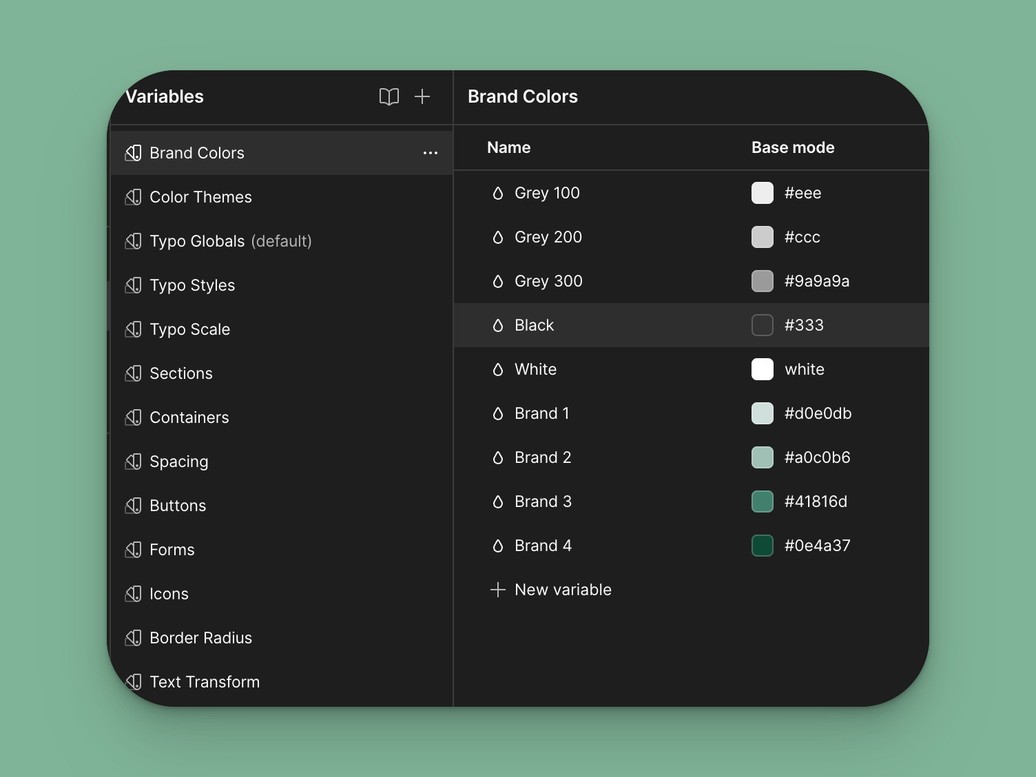
Brand Colors
The first is the brand color collection. Here, I group all the colors used in a project.
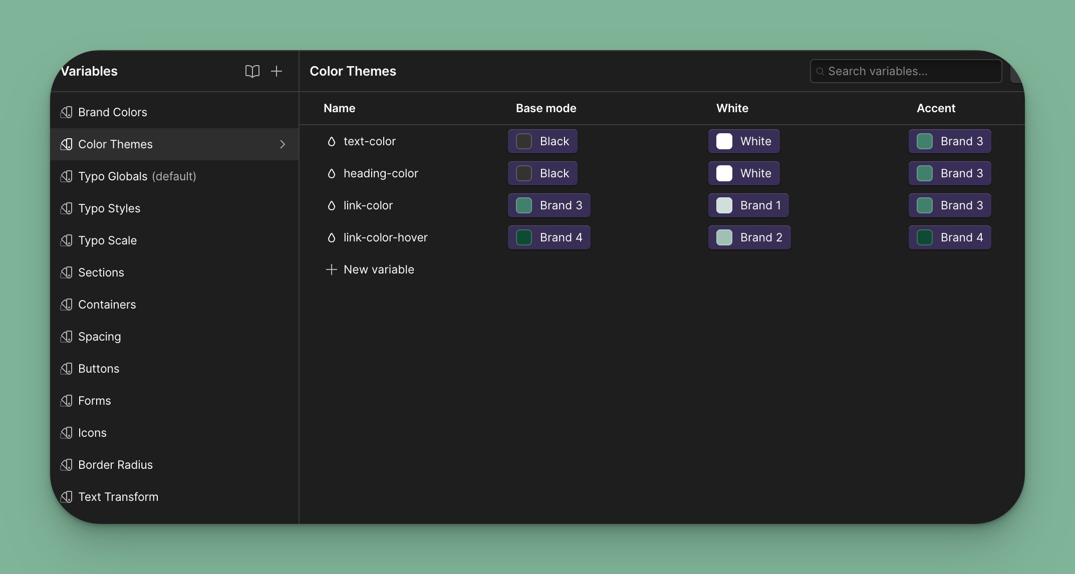
Color Themes
Color themes are the first place I use modes. In this case, manual modes allow me to create a theme I can apply to elements or entire sections. For example, if I have a section with a dark background, I can easily use the White theme, and all my text and links will change to white. I might expand this to include buttons, but I want to try this with an actual project to see if I need it.
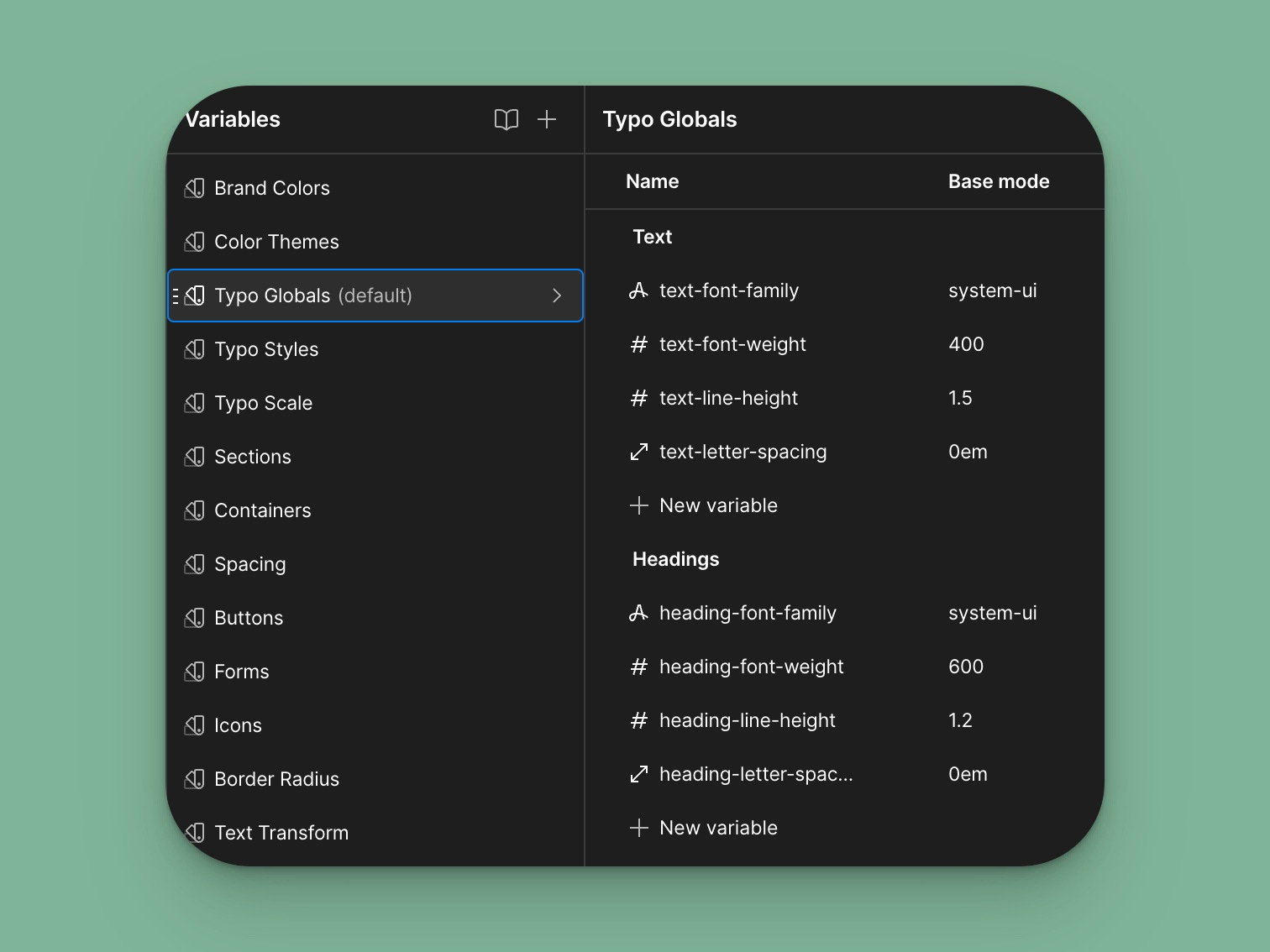
Typography Globals
Global font settings like font family, weight, and spacing are grouped here.
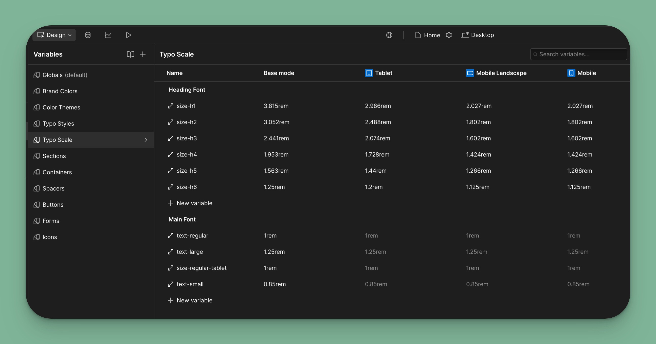
Typography Scale
The first collection using automatic modes is the Typography Scale. I can set text size for headings and main font across all breakpoints.
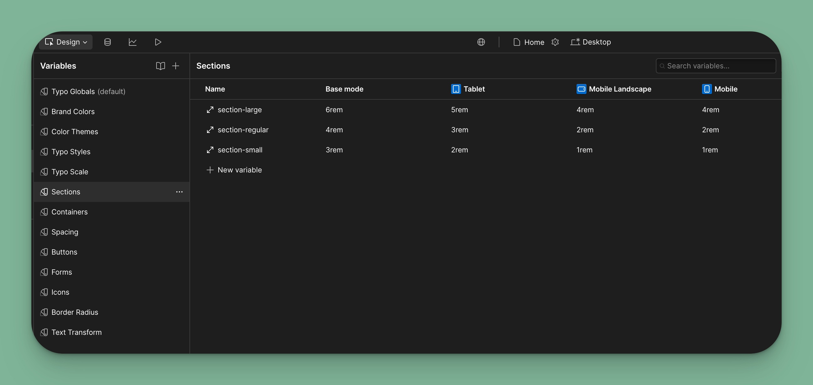
Sections
Setting top and bottom paddings for sections across breakpoints.
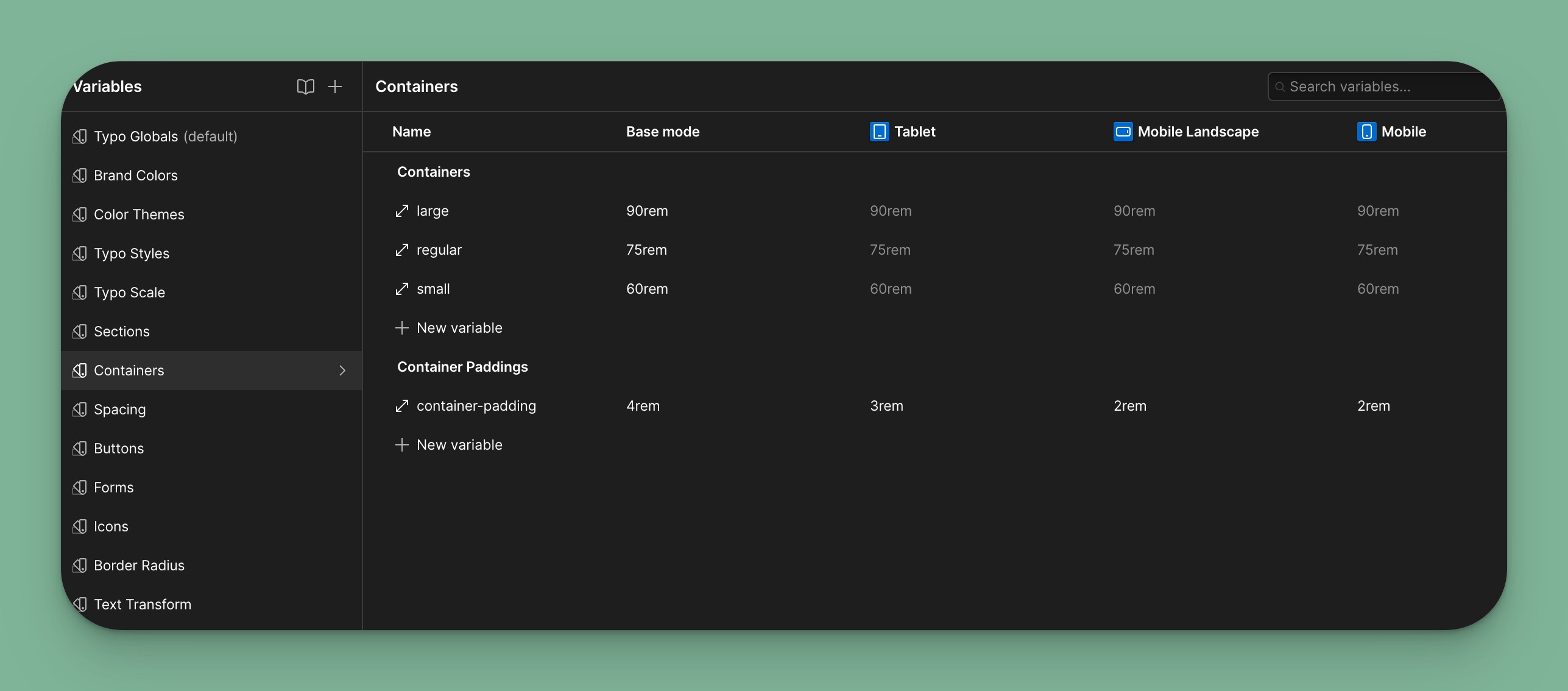
Containers
Container max width and left/right paddings across breakpoints. I’ve kept container max-width as an automatic mode in case I deal with larger breakpoints.
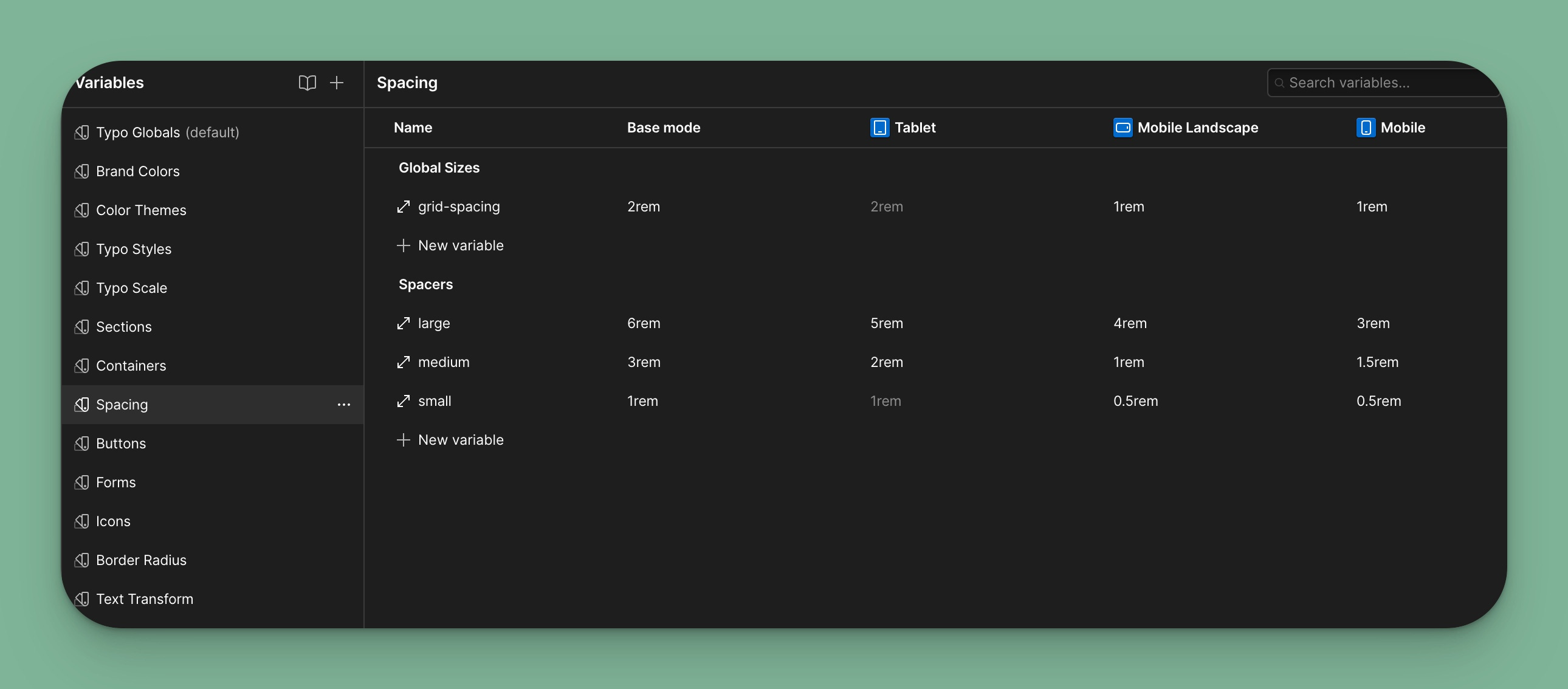
Spacing
This collection groups spacer elements and grid spacing and allows me to define different sizes across breakpoints.
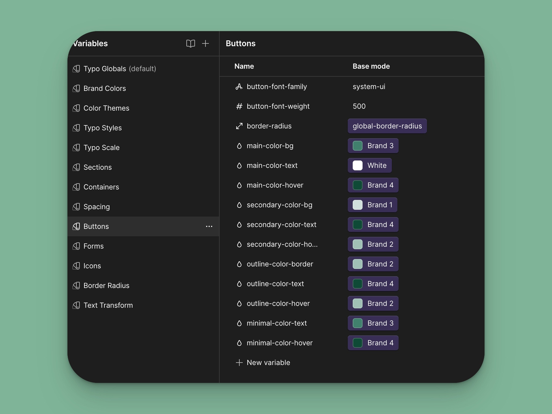
Buttons
This collection has no modes, just a list of variables related to buttons.
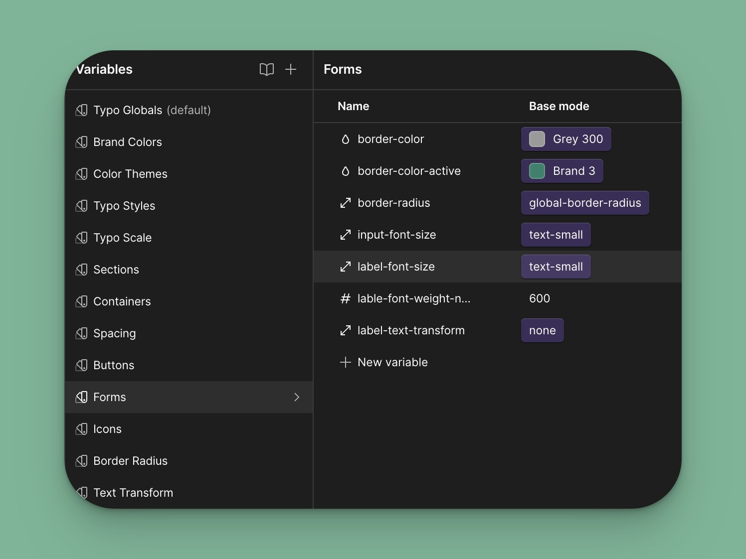
Forms
Style variables related to forms, like border color and radius.
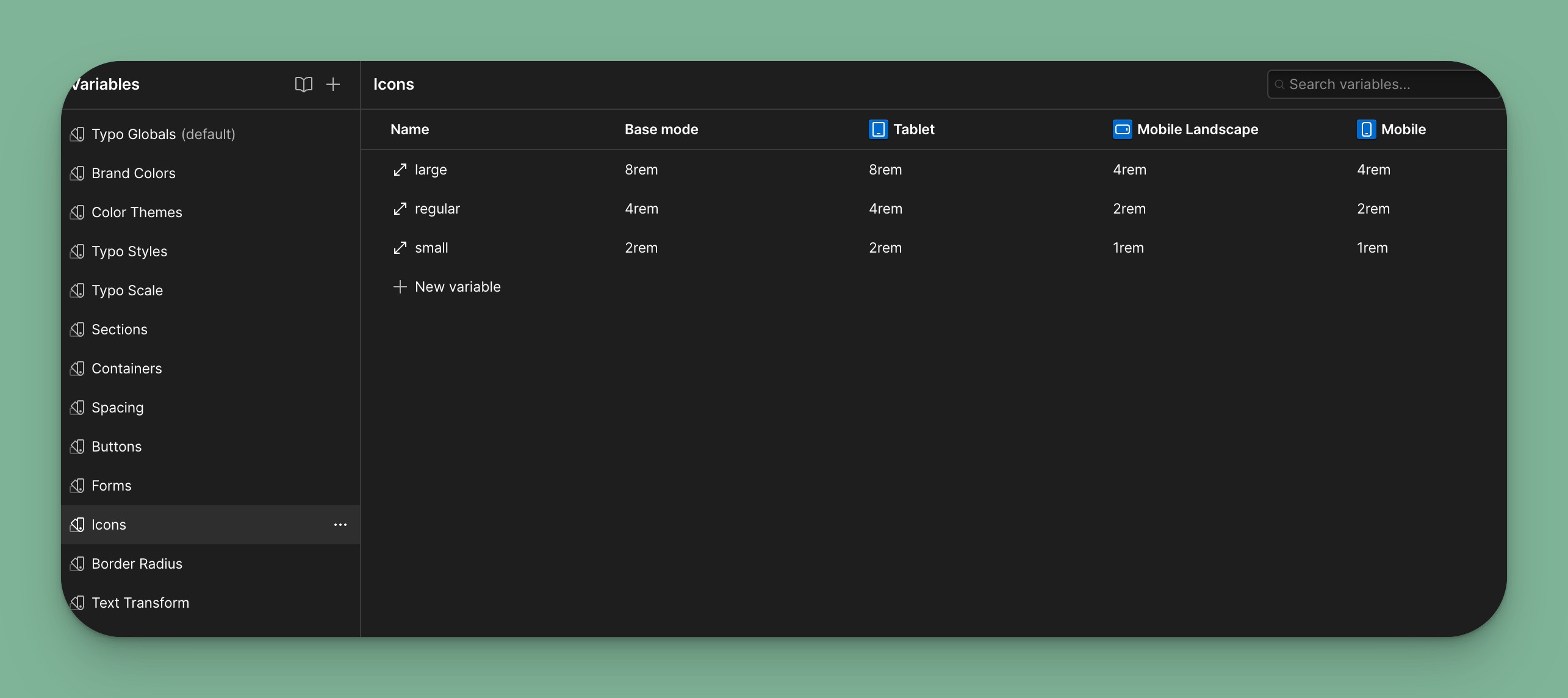
Icons
Another automatic mode for scaling icons across breakpoints.
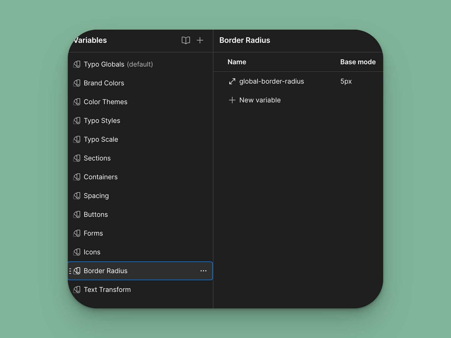
Border radius
Just one setting for global border radius.
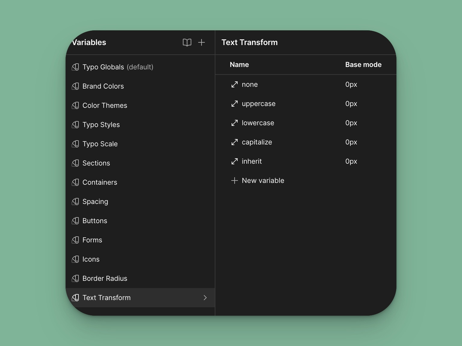
Text Transform
Since Webflow does not support variable types related to text transform values, I had to create a list of text-transform values I can reference. This works thanks to a bit of custom code.
Thanks for reading through this update. Head over to the Webflow to clone the Variables Based Design System. I’d love to hear your thoughts on how I can improve it.
If you enjoy the content I create, and want to get new articles in your inbox, subscribe.
As always, a great read.